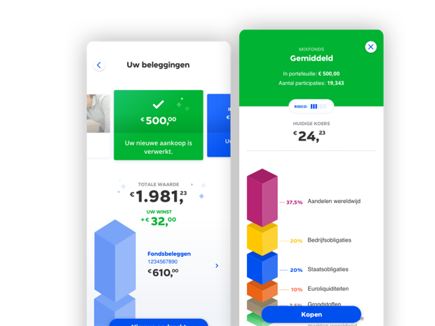
About the project
Dutch insurance company Centaal Beheer was looking for a complex new feature set for the investing part of the app. Paramount were ease of user experience and user-centric design. Our aim was to make it easy, inviting and catalyze a new design direction within Centraal Beheer.
Service
UX Design, UI Design, Design Workshops and Sprints
Release
Feature was released in 2019
Deep understanding
To create deep understanding of the product we organized a 5-day workshop, combining the best of Google design sprints with some secret Triple sauce.
After presenting the new style guide, two designers from Triple were added to the Centraal Beheer scrum team to actually realize UX and design choices within the app.
Breaking the shackles
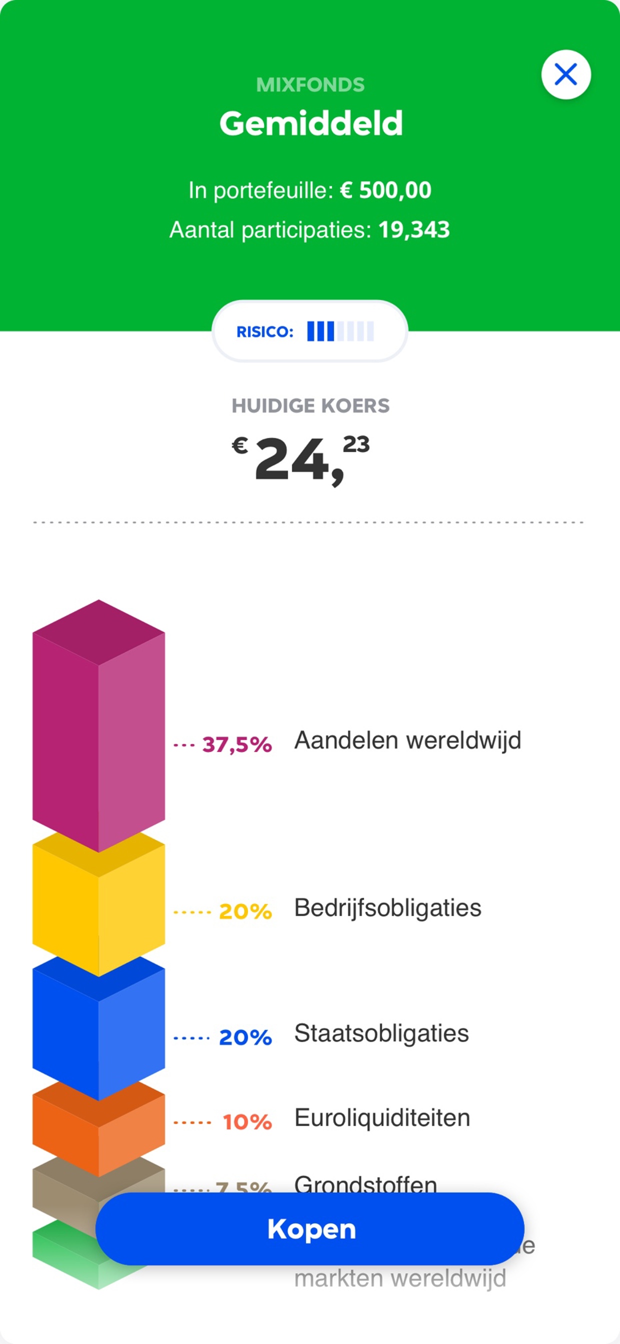
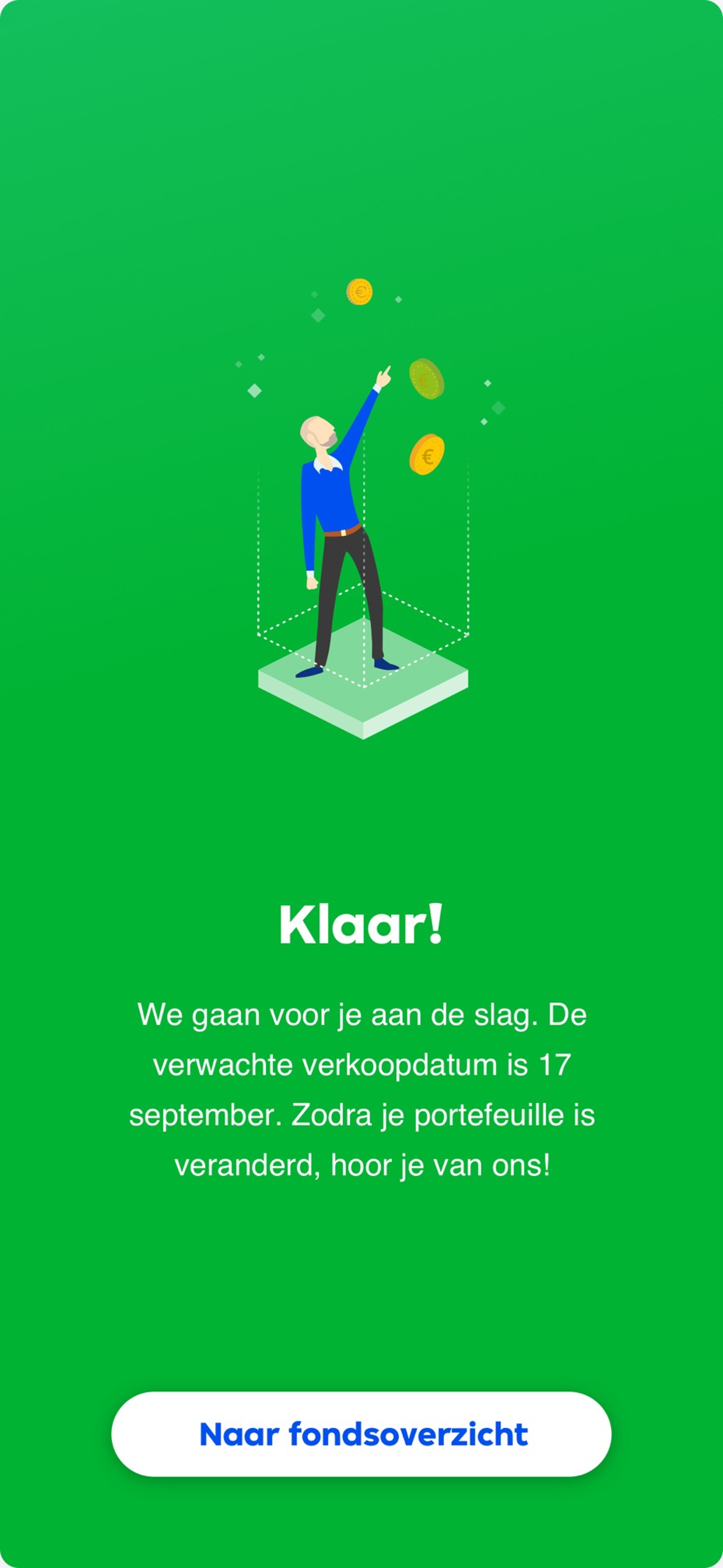
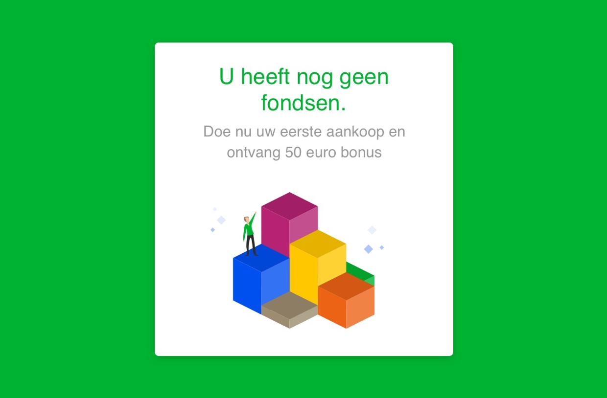
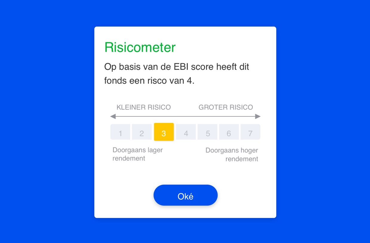
Together with the Centraal Beheer team, we challenged the style guide with splashes of color, just enough to help clients break the shackles, but always staying sensitive to the impact of the brand.
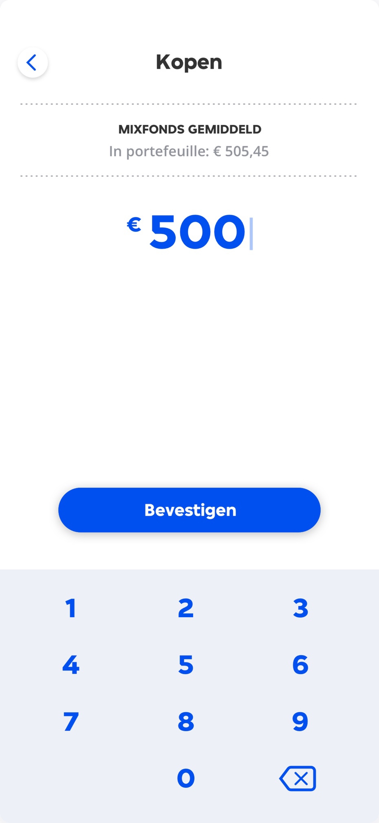
We turned the investment environment into a visual world that informs, educates and entices. The designs create simplicity for new investors and depth for those who know the drill.

Robert Overweg loves to talk about innovation and design. 👌
